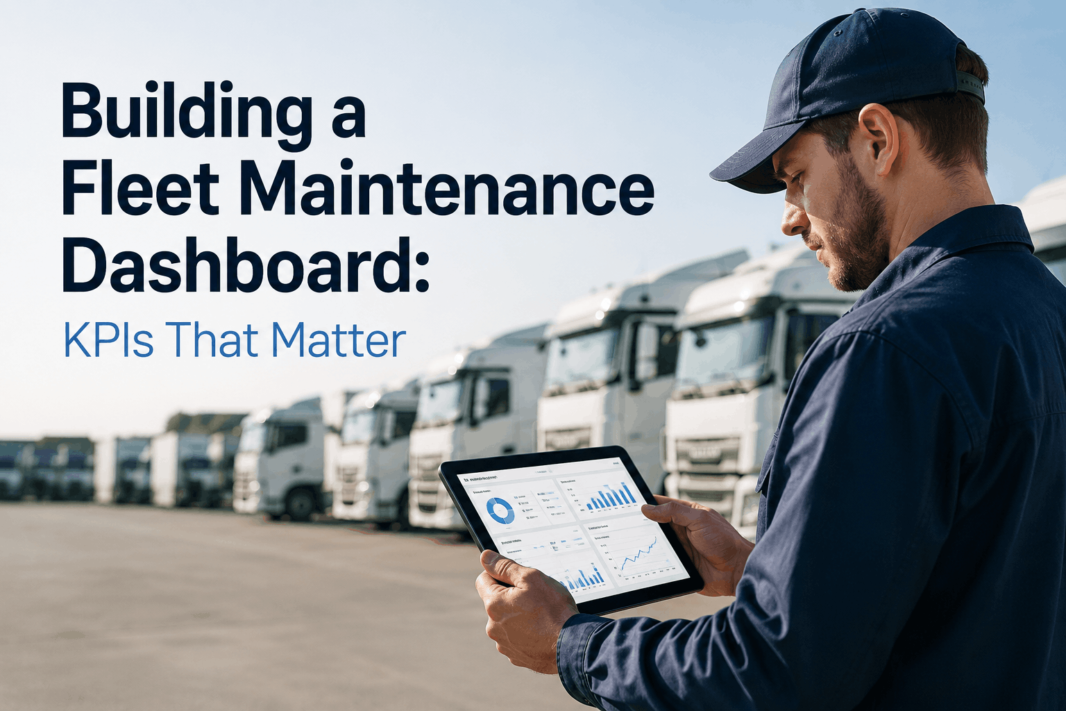
Building a Fleet Maintenance Dashboard: KPIs That Matter
A 150-bus transit fleet in Oregon installed a $50,000 analytics platform. The dashboard had 87 different charts, graphs, and tables. The maintenance manager never used it. Too much information. Too hard to find what mattered. Too many numbers without context. Six months later, the dashboard collected digital dust. The problem wasn't the data — it was the design. A good dashboard doesn't show everything. It shows what matters. It answers three questions at a glance: How are we doing overall? Where are the problems? What needs my attention right now? This guide covers how to build a fleet maintenance dashboard your team will actually use — the KPIs that matter, how to visualize them, and how to drive action from the data.
Dashboard Design 2026
87
Charts → 7 Essential KPIs
Too many metrics create confusion. Seven essential KPIs drive real decisions.
3
Questions a dashboard must answer
10 sec
To spot a problem
7
Essential fleet KPIs
The 7 Essential Fleet Maintenance KPIs
Every dashboard needs a core set of Key Performance Indicators (KPIs). These seven metrics provide complete visibility into fleet health without overwhelming the user.
1
Cost Per Mile (Total Operating)
The single most important fleet metric. Fuel + parts + labor + outside repairs divided by miles driven. Shows overall fleet efficiency. Track monthly. Target varies by region and bus type.
BusCMMS: Real-time cost per mile by bus
2
Preventive Maintenance Compliance %
Percentage of scheduled PMs completed on time. Predicts future breakdowns. Target: 95% or higher. Below 90% triggers warning. Track weekly, not monthly.
BusCMMS: PM compliance dashboard with alerts
3
Breakdown Frequency (per 100k miles)
Number of roadside breakdowns per 100,000 miles. Shows fleet reliability. Target: under 2 per 100k miles. Track monthly. Investigate upward trends immediately.
BusCMMS: Breakdown trends and root cause
4
Fuel Economy (MPG or MPGe)
Miles per gallon (diesel/CNG) or miles per gallon equivalent (electric). Track by bus, by driver, by route. Sudden drops indicate mechanical problems or driver behavior issues.
BusCMMS: MPG tracking by bus and driver
5
Idle Time Percentage
Engine runtime while vehicle is stationary. Every idle minute burns fuel without moving. Target: under 15% of total runtime. Track by bus, by driver. Idle reduction pays quick dividends.
BusCMMS: Idle tracking with driver alerts
6
Mean Time Between Failures (MTBF)
Total operating hours ÷ number of breakdowns. Higher MTBF = more reliable bus. Track by bus, by component. Identify buses with unusually low MTBF for investigation.
BusCMMS: MTBF tracking per bus
7
Warranty Recovery Rate
Percentage of eligible warranty claims successfully recovered. Industry average: 60-70%. Best-in-class: 85-95%. Low rates indicate missing maintenance documentation or missed deadlines.
A useful dashboard answers three questions within 10 seconds of looking at it. Design your dashboard around these questions.
The 3 Questions Every Dashboard Must Answer
QuestionWhat It MeansVisual Cue
How are we doing overall?Summary KPIs with targets. Is the fleet healthy or not?Green/Yellow/Red indicators at top of dashboard
Where are the problems?Trend charts showing changes over time. Is performance improving or declining?Line charts with 12-month trend lines
What needs my attention right now?Exception lists. Specific buses, drivers, or parts that need action.Tables sorted by severity with drill-down links
If your dashboard doesn't answer these three questions in under 10 seconds, it needs redesign. If you can't act on what you see, it's a report, not a dashboard.
Dashboard Redesign Success Story
"Our old dashboard had 60+ metrics. No one used it. We redesigned to show only 7 KPIs with green/yellow/red status, 12-month trends, and an exception list of problem buses. The maintenance manager now opens it every morning. In the first month, they identified 5 buses with chronic brake issues that had been ignored. Repair cost: $8,000. Avoided future breakdown cost: estimated $25,000. The redesigned dashboard paid for itself in one month." — Fleet Analytics Consultant, 200-bus transit system, California
Dashboard Layout: What Goes Where
Physical layout affects how quickly users find information. Follow this proven three-row layout.
Top
Top Row: Summary KPI Cards (7 items)
Cost per mile (current vs target). PM compliance %. Breakdown frequency. Fuel economy (MPG). Idle time %. MTBF. Warranty recovery %. Each card shows: current value, target, status color (green/yellow/red), and month-over-month change arrow.
Middle
Middle Row: Trend Charts (3-4 items)
Cost per mile trend (12 months). PM compliance trend (12 months). Breakdown frequency trend (12 months). Fuel economy trend (12 months). Line charts with easy-to-see direction (improving or declining).
Bottom
Bottom Row: Exception Lists (3-4 items)
Buses with cost per mile >20% above average. Buses with PM overdue. Buses with frequent breakdowns (top 5). Parts below reorder point. Drivers with highest idle time. Click any row to drill down.
Color coding provides instant status awareness. But colors must have clear, consistent meaning across the dashboard.
? Green (Good)
Metric is at or better than target. No action needed. Example: PM compliance at 96% (target 95%). Cost per mile below target. Breakdown frequency below threshold.
? Yellow (Warning)
Metric approaching problem territory. Action recommended. Example: PM compliance at 88% (target 95%). Cost per mile 10% above target. Trend line declining for 3 months.
? Red (Critical)
Metric outside acceptable range. Immediate action required. Example: PM compliance at 75%. Breakdown frequency doubled. Any metric >20% outside target. Emergency.
A dashboard shows the summary. Drill-down shows the detail. Users should be able to click any KPI or exception to see underlying data.
Click
Click Cost Per Mile Card
Drills down to: Cost per mile by bus (table). Cost per mile trend by month (chart). Cost components breakdown (fuel, parts, labor). Buses with highest cost per mile (list). Buses with biggest month-over-month increase (list).
Click
Click PM Compliance Card
Drills down to: PM compliance by bus (table). PM compliance by shop. Overdue PM list (bus, due date, days overdue). PM completion trend by month. PMs due in next 7/14/30 days.
Click
Click Any Exception Row
Click a bus in the exception list. Drills down to: Complete bus profile. Maintenance history. Work orders. DVIRs. Parts usage. Cost per mile trend for that specific bus.
Shop SupervisorOperations focus: PM compliance by bus, overdue PMs, open work orders, parts below reorder point, mechanic productivity.Daily (shift start)
DriversIndividual performance: Personal idle time, MPG, DVIR defect rate compared to fleet average. Gamification/leaderboard.Weekly
BusCMMS provides role-based dashboard views with configurable permissions.
Seven KPIs. Three Questions. One Dashboard.
Real-time fleet maintenance dashboard with stoplight colors, trend charts, exception lists, and drill-down capability. Free 14-day trial.
What are the most important KPIs for a fleet maintenance dashboard?
Cost per mile, PM compliance percentage, breakdown frequency, fuel economy, idle time percentage, mean time between failures (MTBF), and warranty recovery rate.
How many KPIs should a fleet dashboard show?
7-10 KPIs maximum. More than that creates information overload. The dashboard must answer three questions in under 10 seconds — too many metrics prevents quick assessment.
What does a green/yellow/red stoplight mean?
Green = at or better than target. Yellow = approaching problem territory — action recommended. Red = outside acceptable range — immediate action required. Configurable thresholds per KPI.
How often should a fleet dashboard update?
Real-time or daily updates for operational metrics (PM compliance, open work orders). Weekly or monthly for strategic metrics (cost per mile trend, warranty recovery).
Does BusCMMS include pre-built fleet dashboards?
Yes. BusCMMS includes pre-configured dashboards for executives, maintenance managers, shop supervisors, and drivers — all seven KPIs with stoplight colors and drill-down.
What is dashboard drill-down capability?
Drill-down allows users to click any KPI or exception to see underlying details. Example: click cost per mile card → see cost per mile by bus, trend chart, and component breakdown.
Every KPI. Every Bus. Every Day.
Complete fleet maintenance dashboard with the 7 essential KPIs, stoplight colors, trend charts, exception lists, and drill-down. Free 14-day trial.