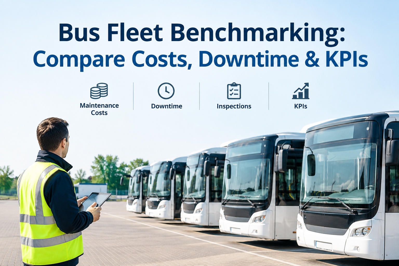
Your fleet runs 94% uptime. Is that good? You cannot answer that without knowing what comparable fleets run -- and that is the whole problem with metrics measured in isolation. Bus fleet benchmarking fixes it: it puts your cost, downtime, and compliance numbers next to fleets of similar size, type, and duty cycle, so you finally know whether a number is strong, average, or quietly bleeding money.
Bus Fleet Benchmarking: Compare Your Costs, Downtime & KPIs Against Peers
The metrics that matter, the peer data sources that hold up, and how to know if your fleet is genuinely performing -- or just beating last year.
- $0.38Top
- $0.55Median
- $0.72+Bottom
Same vehicle class. Same duty cycle. The gap is what benchmarking reveals.
A Number Without a Peer Is Just a Number
Every fleet manager tracks cost per mile, uptime, and PM compliance. Very few can tell you whether their numbers are good. That is the trap: without an outside reference point, every metric looks acceptable because there is nothing to measure it against.
A transit authority in Kansas felt confident at 94% uptime -- until they benchmarked against peers and found the standard was 96.2%, with top performers at 98%. They were not failing. They were middle of the pack, and that blind spot was quietly costing them.
Same fleet, same number -- completely different conversation. Bus fleet benchmarking turns an isolated figure into strategic intelligence: what is controllable, what is competitive, and what is broken.
On identical vehicle classes and duty cycles, the cost-per-mile gap between bottom-quartile and top-quartile fleets routinely runs 40% or more. That gap is not luck -- it is measurable, and it is where your budget lives. You can book a demo of the BusCMMS analytics dashboard to see your own numbers plotted against your fleet type.
The 8 Metrics Every Bus Fleet Should Benchmark
Professional fleet benchmarking spreads across eight metric categories. Track fewer and you miss the story; track more and you drown. These eight cover cost, reliability, safety, and compliance -- the four things a director actually has to defend.
- FINANCIAL
Cost Per Mile
The headline number. School buses average $0.55/mi, transit $0.68/mi; best-in-class run 35–45% lower.
- FINANCIAL
Cost Per Vehicle
Annual maintenance spend per bus — roughly $22K–$38K depending on type and age.
- RELIABILITY
MDBF
Mean Distance Between Failures — the FTA NTD reliability metric. Well-run school fleets target 9,000+ miles.
- RELIABILITY
Fleet Availability
Percent of buses ready to dispatch. Industry standard sits near 96%; top performers hit 98%.
- RELIABILITY
PM Compliance
Share of PMs done on schedule. The single metric that drives every other one. Target 90%+.
- RELIABILITY
Scheduled vs. Unscheduled
The planned-to-reactive ratio. Best fleets run 75%+ scheduled; below 65% signals a reactive shop.
- SAFETY
Accident Rate
Incidents per million miles — the metric that touches both insurance premiums and student safety.
- COMPLIANCE
DVIR Completion
Percent of inspections completed and documented. Audit readiness for FMCSA and state DOT lives here.
Cost per mile is the headline, but the reliability metrics explain why it lands where it does. A fleet with weak PM compliance and a low scheduled ratio will always show high cost per mile -- the benchmark makes the cause visible. For the full breakdown by fleet type, our bus maintenance cost per mile guide runs the ranges; this page is about comparing all eight against the right peers.
Comparing Against the Wrong Fleet Makes You Look Worse Than You Are
Here is where most benchmarking goes wrong. A 75-bus urban transit system that measures itself against 400-bus regional carriers or 25-bus rural shuttles gets a useless answer. The benchmark only means something when the fleet on the other side of it actually resembles yours.
- Fleet Size50 buses and 200 buses have completely different cost structures and buying power
- Operating ModelFixed-route transit, school routes, on-demand paratransit, and coach service each run different math
- GeographyLabor rates, fuel costs, and weather swing maintenance spend region to region
- Fleet AgeAverage age drives maintenance spend; an 11-year fleet cannot fairly compare to a 5-year one
Sometimes a higher cost per mile does not mean you are inefficient -- it means you run a heavier duty cycle than the fleets you compared to. That is the real value of good benchmarking: it does not just hand you a verdict, it helps you ask the right question. Getting the peer match right is worth walking through with your own fleet profile in a demo.
Where Defensible Peer Data Actually Comes From
A benchmark is only as good as the data behind it. When you tell a board "we run above the median," the first question is "says who?" These are the four sources that hold up under that question -- ranked from most accessible to most powerful.
- 01
FTA National Transit Database (NTD)
Free, public reporting for transit systems. MDBF, cost, and availability data by agency -- the reference standard for U.S. transit benchmarking.
- 02
Industry Associations
APTA, NAPT, and regional transit councils publish maintenance performance studies and fleet reliability data by segment.
- 03
Peer Network Data
Transit agencies and districts sharing metrics directly. Powerful when the peer group is genuinely comparable in size and model.
- 04
Vendor-Accumulated Data
When peers run the same platform you do, the software already holds normalized, comparable data across similar fleets -- the fastest route to a live benchmark.
The catch with the first three is lag and effort -- NTD and association studies publish annually, and pulling peer data by hand is a project nobody has time for. Vendor-accumulated benchmarking solves that: the numbers are already normalized and refreshed every reporting period. You can sign up free and start tracking the metrics that feed a live benchmark this week.
A Benchmark Is Only Useful If It Changes What You Do Monday
Knowing you are middle of the pack is not the point. The point is what you do about it. Here is the loop that turns a benchmark gap into a lower cost per mile -- the same sequence top-quartile fleets run every reporting cycle.
Most gaps trace back to one root cause: PM compliance. Fleets that benchmark regularly run higher compliance than those that only look inward -- the comparison creates the pressure to close the gap. Each 10-point gain cuts unplanned failures 8 to 12 percent, lifting MDBF and availability at once. You can sign up free and start closing your first gap right away.
How BusCMMS Turns Your Data Into a Live Benchmark
Spreadsheets cannot benchmark a fleet -- they hold your numbers but have nothing to compare them to, and no way to normalize for size or duty cycle. BusCMMS is built for buses from day one, so the metrics come out clean and comparison-ready. These are the capabilities that put your fleet's position on the map.
Auto-Calculated KPIs
Cost per mile, MDBF, availability, and PM compliance computed from work orders -- no spreadsheet math.
Trend Over Time
Every metric plotted across 12 months so you see whether a gap is closing or widening.
Problem-Bus Flags
Exception reports surface the outlier buses dragging your fleet average up before they break again.
Fuel-Type PM Logic
Diesel, CNG, and electric buses benchmarked on their own PM curves, not a blended average.
Audit-Ready Compliance
DVIR completion and NTD-ready reliability data generated on demand for FMCSA, FTA, and state DOT.
Board-Ready Exports
One-click reports showing where you rank and which gap you are closing this quarter.
BusCMMS reports customers cutting cost per mile 25 to 35 percent within 12 to 18 months (customer-reported), with rollout in two to four weeks. The reason benchmarking accelerates that is simple: you cannot improve a number you cannot place. See where your fleet ranks -- book a demo and get your metrics plotted against your fleet type.
Bus Fleet Benchmarking Turns Numbers Into Decisions
A metric measured in isolation can only tell you if you beat last year. A metric measured against the right peers tells you whether you are genuinely good -- and exactly where to push next.
- Compare the eight core metrics, not just cost per mile
- Match size, model, geography, and age before comparing
- Use defensible sources — NTD, APTA, or normalized platform data
- Turn the biggest gap into one action each cycle
Do that and benchmarking stops being an annual report you file and becomes the loop that quietly moves your fleet from middle of the pack to the top quartile -- one closed gap at a time.
Frequently Asked Questions
What is bus fleet benchmarking?
Bus fleet benchmarking is the practice of comparing your fleet's operational, financial, and safety metrics -- cost per mile, downtime, MDBF, PM compliance, DVIR completion, and more -- against peer fleets of similar size, type, and duty cycle. The goal is context: a number like 94% uptime or $0.54 per mile means nothing until you know what comparable fleets achieve. Benchmarking converts isolated metrics into strategic intelligence, showing exactly which cost or reliability categories are creating the gap between your fleet and top performers in your segment.
Which metrics should a bus fleet benchmark?
Eight metrics across four categories cover it. Financial: cost per mile and maintenance cost per vehicle. Reliability: MDBF (mean distance between failures), fleet availability, PM compliance rate, and the scheduled-to-unscheduled ratio. Safety: accident rate per million miles. Compliance: DVIR completion rate. Cost per mile is the headline, but the reliability metrics explain why it lands where it does -- a fleet with low PM compliance and a high reactive ratio will always show elevated cost per mile, and benchmarking makes that cause visible.
How do I find the right peer fleets to compare against?
Match four variables before you compare: fleet size (a 75-bus system should benchmark against 50–100-bus peers, not 400-bus carriers), operating model (fixed-route transit, school routes, paratransit, and coach each run different economics), geography (labor, fuel, and weather vary by region), and average fleet age (an 11-year fleet cannot fairly compare to a 5-year one). A comparison against a mismatched fleet produces a misleading verdict -- sometimes a higher cost per mile just reflects a heavier duty cycle, not inefficiency.
Where does defensible bus fleet benchmarking data come from?
Four sources hold up. The FTA National Transit Database (NTD) offers free public reliability, cost, and availability data for transit systems and is the U.S. reference standard. Industry associations like APTA and NAPT publish maintenance performance and reliability studies by segment. Peer networks let comparable agencies share metrics directly. And vendor-accumulated data -- when peers run the same platform -- provides already-normalized, continuously refreshed benchmarks without an annual consulting engagement, which is why it has become the practical choice for most fleets.
How does BusCMMS help with fleet benchmarking?
BusCMMS auto-calculates the core benchmark metrics -- cost per mile, MDBF, fleet availability, PM compliance, and DVIR completion -- directly from work-order and inspection data, so the numbers come out clean and comparison-ready. It trends each metric over 12 months, flags the outlier buses dragging your average up, and benchmarks diesel, CNG, and electric buses on their own PM curves rather than a blended average. Board-ready exports show where your fleet ranks and which gap you are closing, and NTD-ready reliability data supports FTA and state DOT reporting on demand.