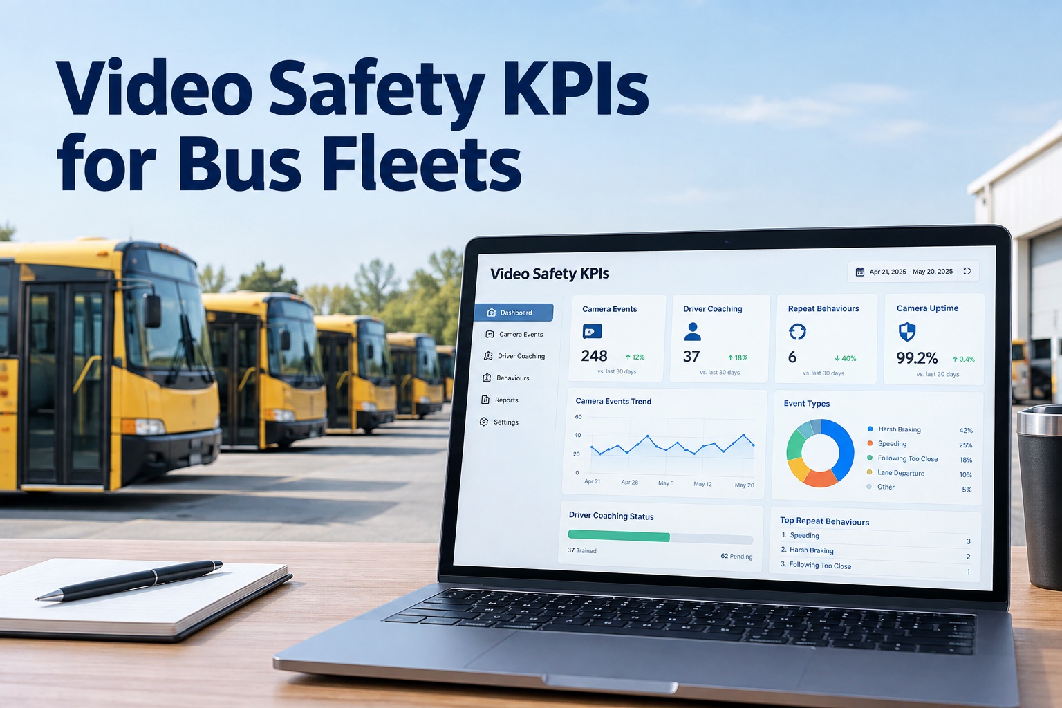
A safety programme you can't measure is just a hope. Cameras generate thousands of events, drivers get coached, incidents happen — but without the right KPIs on one dashboard, none of it tells you whether the fleet is actually getting safer. This page lays out the video-safety metrics that matter, how leading and lagging indicators work together, and how to turn scattered camera data into a board-ready safety dashboard.
Video Safety KPIs for Bus Fleets
Track the metrics that prove your fleet is getting safer — camera events, coaching, repeat behaviours, and camera uptime — on one BusCMMS dashboard tied to every bus.
- 6Core safety KPIs
- Lead+ lagging indicators
- BoardReady reporting
Why a Safety Dashboard Beats a Pile of Clips
Most fleets collect safety data — camera events, incident reports, coaching notes — but it lives in separate places and nobody rolls it up. The result is activity without insight: lots of clips, no answer to the one question that matters. Is the fleet safer than it was last quarter?
A KPI dashboard answers that. It turns raw camera and coaching activity into a small set of numbers that show direction, spotlight who and what needs attention, and give you something concrete to report upward. That's the difference between running a safety programme and just owning cameras — and you can book a walkthrough of the safety dashboard to see it.
The 6 KPIs Every Video-Safety Programme Should Track
Six metrics tell the story of a video-safety programme. Together they answer what's happening, whether you're acting on it, and whether it's working.
Safety events per 1,000 miles
Normalised event rate — harsh braking, near-misses, contacts — per distance driven. The headline number that shows whether risk is trending up or down.
Coaching completion rate
The share of flagged events that actually got coached. A pile of events with low coaching completion means the programme isn't closing the loop.
Repeat-behaviour rate
How often the same driver repeats the same flagged behaviour after coaching. The truest test of whether coaching is actually changing habits.
Camera / system uptime
The percentage of cameras actually working. A dead camera is a blind spot — and a KPI nobody tracks until an incident has no footage.
Event resolution time
How long from a flagged event to a coached driver or closed action. Slow resolution means safety issues sit open while risk continues.
Incident & claim trend
The lagging outcome — actual incidents and claims over time. The number the board cares about, and the one everything else should move.
Read together, these six form a chain: events show risk, coaching completion and resolution time show you're acting, repeat rate shows it's working, uptime keeps the data honest, and incidents confirm the outcome. Miss any link and the dashboard lies. Seeing all six from one data set is the whole idea — you can start free and build your safety dashboard.
Leading vs. Lagging: The Two Kinds of Safety Metric
Not all KPIs do the same job. Some predict; some confirm. A dashboard that only shows one kind is either blind to the future or blind to the result. You need both.
Leading (predictive)
- Safety events per 1,000 miles
- Coaching completion rate
- Repeat-behaviour rate
- Event resolution time
- Camera uptime
Move these now to change the outcome later.
Lagging (outcome)
- Actual incidents over time
- Insurance claims & cost
- Damage / repair from incidents
- Injury reports
These confirm whether the leading work paid off.
The mistake most fleets make is watching only lagging numbers — incidents and claims — which tell you about failures that already happened. Leading indicators let you act before the incident: a rising event rate or a stalled coaching completion is a warning you can respond to. Track both, and the dashboard becomes a steering wheel, not a rear-view mirror.
Reading the Dashboard: What the Numbers Tell You Together
Individual KPIs mislead; the relationships between them tell the truth. Here's how to read the dashboard as a story instead of six separate numbers.
That last row is the trap: a dashboard can look great for the wrong reason. Low camera uptime quietly deflates every other metric, so it belongs on the same screen as the safety numbers, not buried in IT. When the KPIs come from one connected system, these patterns are obvious — which is exactly what a demo shows on your own fleet.
Building a Dashboard That Actually Works
A useful safety dashboard follows a few principles. Skip them and you get a wall of charts nobody reads; follow them and you get a tool the whole team acts on.
- 1
One source, not four
Pull events, coaching, uptime, and incidents from one connected system so the numbers agree and roll up per bus, per driver, and fleet-wide.
- 2
Few metrics, clearly trended
Six KPIs with direction beat thirty static charts. Every metric should show change over time, not just a snapshot.
- 3
Drill from fleet to bus
A headline number is a start; the value is drilling into which bus or driver drives it, so a trend becomes a specific action.
- 4
Built for the board
One clean view you can put in front of leadership — direction and outcomes, no spreadsheet archaeology the week before the meeting.
The unifying principle is one source of truth. A dashboard stitched together from a camera portal, a coaching spreadsheet, and an incident log will always disagree with itself. One platform that already holds events, coaching, and maintenance produces a dashboard you can trust — instead of one that argues with itself.
How BusCMMS Powers Your Safety Dashboard
The six KPIs only work from one connected data set — which is exactly what BusCMMS provides. Events, coaching, uptime, and outcomes all live on the same bus records that feed the dashboard.
One data set, all six KPIs
Camera events, coaching, uptime, and incidents on one record — so every KPI is consistent and no metric is stitched from a separate tool.
Event-to-coaching tracked
Every flagged event routes into a coaching record, so completion rate and repeat-behaviour rate are measured, not guessed.
Per-bus & per-driver drill-down
Drill from a fleet trend to the specific bus or driver behind it, turning a dashboard number into a concrete next action.
Hardware-agnostic inputs
Feeds from the cameras and MDVRs you already run, so the dashboard reflects your real fleet without a hardware swap.
That's the role BusCMMS plays. The AI-native, hardware-agnostic platform holds camera events, coaching, uptime, and incidents on one record — so your six safety KPIs come from a single source, roll up per bus and fleet-wide, and drill to a specific action. It's a dashboard you can defend, not a spreadsheet you assemble in a panic. To build yours, book a walkthrough of the safety KPI dashboard.
The Bottom Line on Video Safety KPIs
A video-safety programme is only as good as the numbers that prove it works. Six KPIs — events per 1,000 miles, coaching completion, repeat-behaviour rate, camera uptime, event resolution time, and incident trend — turn a pile of clips into a clear answer: is the fleet getting safer? Watch leading and lagging indicators together, and you can steer instead of just reacting.
The catch is that these numbers only tell the truth from one connected source. Stitch them from separate tools and the dashboard argues with itself; run them from one platform and you get a safety story you can put in front of any board. That's what BusCMMS is built to deliver. If you're ready to see your fleet's real safety KPIs, start free, and verify the requirements that apply to your operation before you build.
What are the most important bus video-safety KPIs?
Six KPIs cover a video-safety programme: safety events per 1,000 miles (a normalised risk rate), coaching completion rate (the share of flagged events actually coached), repeat-behaviour rate (whether coaching changes habits), camera or system uptime (whether the data is even complete), event resolution time (how fast issues get closed), and incident and claim trend (the actual outcome). Together they show what's happening, whether you're acting on it, and whether it's working. Watching them as a chain rather than in isolation is what makes the dashboard meaningful.
What's the difference between leading and lagging safety indicators?
Leading indicators are predictive and let you act before an incident, things like event rate per mile, coaching completion, repeat-behaviour rate, resolution time, and camera uptime. Lagging indicators are outcomes that confirm results after the fact, like actual incidents, insurance claims, damage, and injuries. The common mistake is watching only lagging numbers, which tell you about failures that already happened. Tracking both means a rising event rate or a stalled coaching completion becomes an early warning you can respond to, turning the dashboard into a steering wheel rather than a rear-view mirror.
Why does camera uptime belong on a safety dashboard?
Because a dead camera is a blind spot that quietly distorts every other metric. If cameras are down, events aren't being captured, so your event rate can look great for entirely the wrong reason, and an incident may have no footage when you need it. Camera uptime keeps the rest of the dashboard honest, which is why it belongs on the same screen as the safety numbers rather than buried in IT. A safety dashboard that ignores uptime can look clean while the programme is actually flying blind.
How do I build a bus safety KPI dashboard?
Follow a few principles: pull all the metrics from one connected system so the numbers agree, track a small set of KPIs shown as trends over time rather than a wall of static charts, make every headline number drillable from fleet down to the specific bus or driver, and design one clean view you can put in front of leadership. The unifying requirement is a single source of truth. A dashboard stitched from a camera portal, a coaching spreadsheet, and an incident log will always disagree with itself, while one platform holding events, coaching, and outcomes produces a dashboard you can trust.
Does BusCMMS provide safety KPI reporting?
BusCMMS holds camera events, driver coaching, camera uptime, and incident history on one bus record, so the six core safety KPIs come from a single source rather than being stitched from separate tools. That means event rate, coaching completion, repeat-behaviour rate, uptime, resolution time, and incident trend stay consistent, roll up per bus and fleet-wide, and drill down to a specific bus or driver for action. Because it's hardware-agnostic, it feeds from the cameras and MDVRs you already run, so the dashboard reflects your real fleet without a hardware swap.